
*This article was modeled from the current Adobe React SPA documentation.
Learn how to map Vue components to Adobe Experience Manager (AEM) components with the AEM SPA Editor JS SDK. Component mapping enables users to make dynamic updates to SPA components within the AEM SPA Editor, similar to traditional AEM authoring.
This chapter takes a deeper-dive into the AEM JSON model API and how the JSON content exposed by an AEM component can be automatically injected into a Vue component as props.
Objective
- Learn how to map AEM components to SPA Components.
- Inspect how a Vue component uses dynamic properties passed from AEM.
- Learn how to use out of the box AEM Core Components
What you will build
This chapter will inspect how the provided Text SPA component is mapped to the AEM Textcomponent. AEM Core Components like the Image component will be used in the SPA and authored in AEM. Out of the box features of the Layout Container and Template Editor policies will also be used to create a view that is a little more varied in appearance.
Prerequisites
Review the required tooling and instructions for setting up a local development environment. This chapter is a continuation of the Integrate the SPA chapter, however to follow along all you need is a SPA-enabled AEM project.
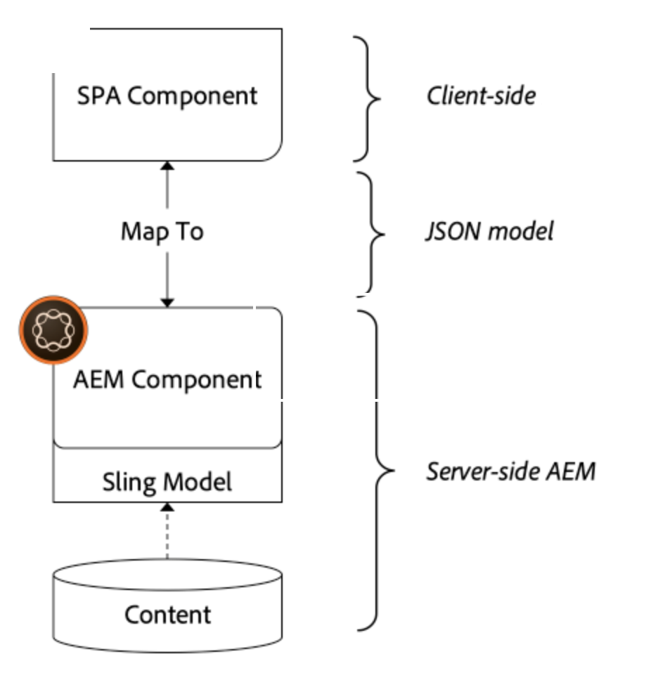
Mapping Approach
The basic concept is to map a SPA Component to an AEM Component. AEM components, run server-side, export content as part of the JSON model API. The JSON content is consumed by the SPA, running client-side in the browser. A 1:1 mapping between SPA components and an AEM component is created.
Inspect the Text Component
The AEM Project Archetype provides a Text component that is mapped to the AEM Text component. This is an example of a content component, in that it renders content from AEM.
Let’s see how the component works.
Inspect the JSON model
- Before jumping into the SPA code, it is important to understand the JSON model that AEM provides. Navigate to the Core Component Library and view the page for the Text component. The Core Component Library provides examples of all the AEM Core Components.
- Select the JSON tab for one of the examples:
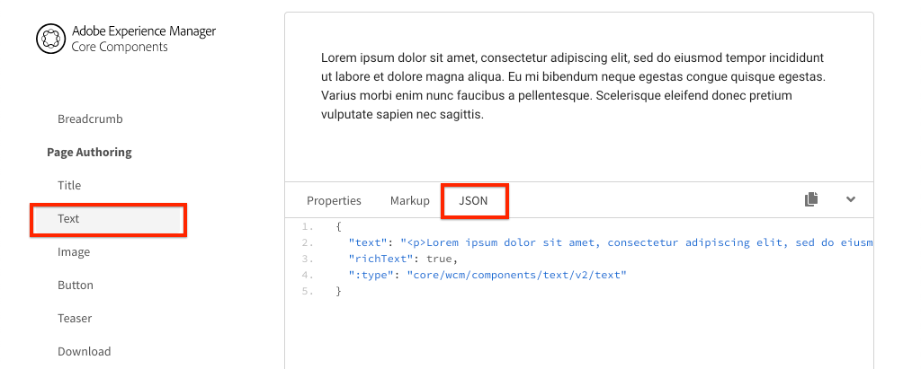 You should see three properties:
 text,richText, and:type.:typeis a reserved property that lists thesling:resourceType(or path) of the AEM Component. The value of:typeis what is used to map the AEM component to the SPA component.textandrichTextare additional properties that will be exposed to the SPA component. - View the JSON output at http://localhost:4502/content/wknd-spa-vue/us/en.model.json. You should be able to find an entry similar to:
"text": {
 "id": "text-a647cec03a",
 "text": "<p>Hello World! Updated content!</p>\r\n",
 "richText": true,
 ":type": "wknd-spa-vue/components/text",
 "dataLayer": {}
}
Inspect the Text SPA component
- In the IDE of your choice open up the AEM Project for the SPA. Expand the
ui.frontendmodule and open the fileText.vueunderui.frontend/src/components/Text/Text.vue.
<template>
  <div>
    <div
      v-if="richText"
      :id="modelId"
      data-rte-editelement
      v-html="getRichTextContent()"
    ></div>
    <div v-else
         :id="modelId"
         data-rte-editelement
         v-html="text">
    </div>
  </div>
</template>

<script>
import DOMPurify from 'dompurify'
import extractModelId from '../../utils/extract-model-id'

export default {
  name: 'Text',
  props: {
    cqPath: {
      type: String
    },
    richText: {
      type: Boolean
    },
    text: {
      type: String
    }
  },
  computed: {
    modelId () {
      return extractModelId(this.cqPath)
    }
  },
  methods: {
    getRichTextContent () {
      return DOMPurify.sanitize(this.text)
    }
  }
}

</script>
<style scoped lang="scss">
</style>
2. Text is a standard Vue component. The component uses this.richText to determine whether the content to render is going to be rich text or plain text. The actual “content” used comes from this.text.To avoid a potential XSS attack, the rich text is escaped via DOMPurify before using dangerouslySetInnerHTML to render the content. Recall the richText and text properties from the JSON model earlier in the exercise.
- Next take a look at the
MapTowithin map-components.js.
// Text Component Mapping
MapTo('wknd-spa-vue/components/text')(
  Text,
  {
    emptyLabel: 'Text',
    isEmpty: function (props) {
      return !props || !props.text || props.text.trim().length < 1
    },
    resourceType: 'wknd-spa-vue/components/text'
  }
)
The above code is responsible for mapping the SPA Text component to the AEM Compoennt and determining when to render the placeholder in the AEM author environment. If the isEmpty method returns true then the placeholder will be rendered.
MapTo is provided by the AEM SPA Editor JS SDK (@mavice/aem-vue-editable-components). The path wknd-spa-vue/components/text represents the sling:resourceType of the AEM component. This path gets matched with the :type exposed by the JSON model observed earlier. MapTo takes care of parsing the JSON model response and passing the correct values as props to the SPA component.
You can find the AEM Text component definition at ui.apps/src/main/content/jcr_root/apps/wknd-spa-vue/components/text.
Use Vue Core Components
- In the project code open the file
map-components.jsatui.frontend/src.
This file imports all of the SPA components that map to AEM components. Given the dynamic nature of the SPA Editor implementation, we must explicitly reference any SPA components that are tied to AEM author-able components. This allows an AEM author to choose to use a component wherever they want in the application.
- The following import statements include SPA components written in the project:
import Text from './components/Text/Text'
import Image from './component/Image/Image'
Update AEM Policies
Policies are a feature of AEM templates gives developers and power-users granular control over which components are available to be used. The AEM Core Components are included in the SPA Code but need to be enabled via a policy before they can be used in the application.
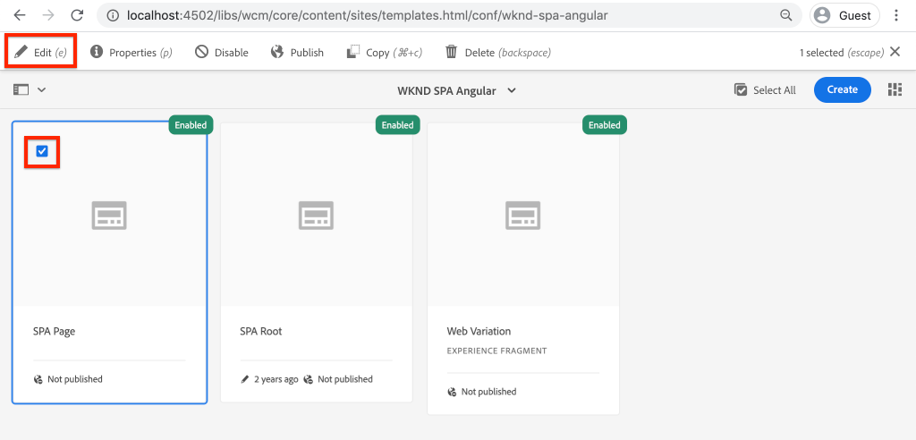
- From the AEM Start screen navigate to Tools > Templates > WKND SPA Vue.
- Select and open the SPA Page template for editing.
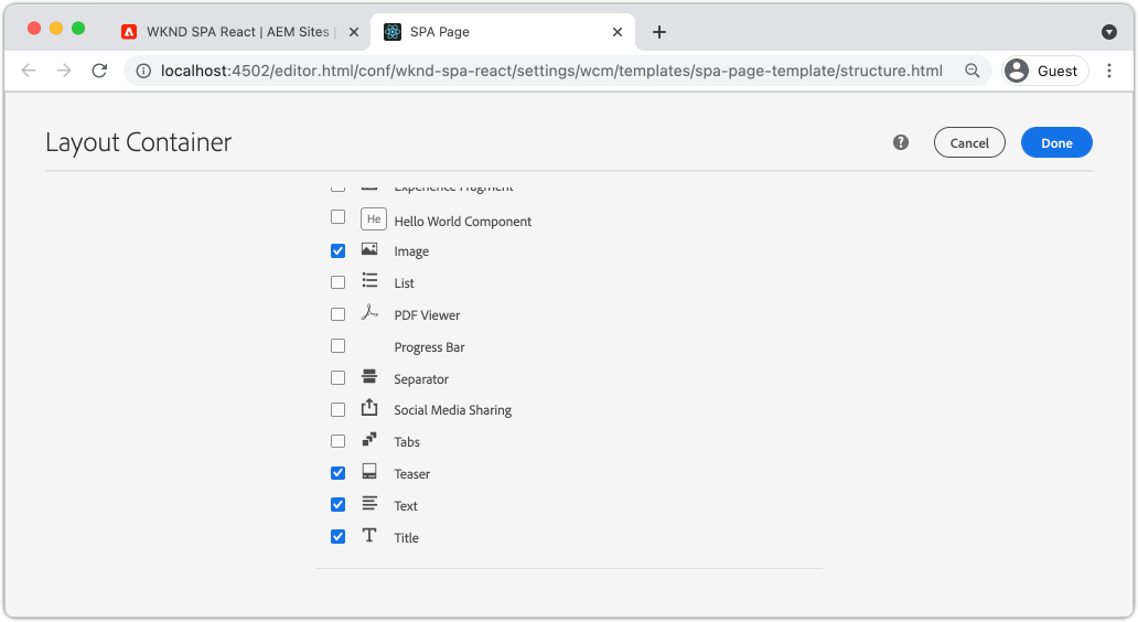
- Select the Layout Container and click it’s policy icon to edit the policy:
- Under Allowed Components > WKND SPA Vue – Content > check Image.
 Under Default Components > Add mapping and choose the Image – WKND SPA Vue – Content component:
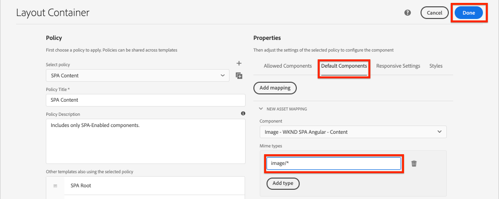 Enter a mime type of
 image/*.Click Done to save the policy updates.
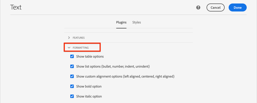
- In the Layout Container click the policy icon for the Text component. Create a new policy named WKND SPA Text. Under Plugins > Formatting > check all the boxes to enable additional formatting options:
 Under Plugins > Paragraph Styles > check the box to Enable paragraph styles:
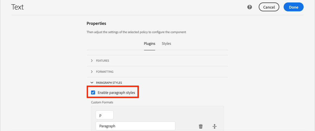 Click Done to save the policy update.
 - Create an Image component in the components folder and map it to the AEM component within map-components.js
<template>
<img :src="src"/>
</template>

<script>
export default {
  name: 'Image',
  props: {
    src: {
      type: String
    }
  }
}
</script>

<style scoped>

</style>
// Image Component Mapping
MapTo('wknd-spa-vue/components/image')(
  Image,
  {
    emptyLabel: 'Image',
    isEmpty: function (props) {
      return !props || !props.src || props.src.trim().length < 1
    },
    resourceType: 'wknd-spa-vue/components/image'
  }
)
Author Content
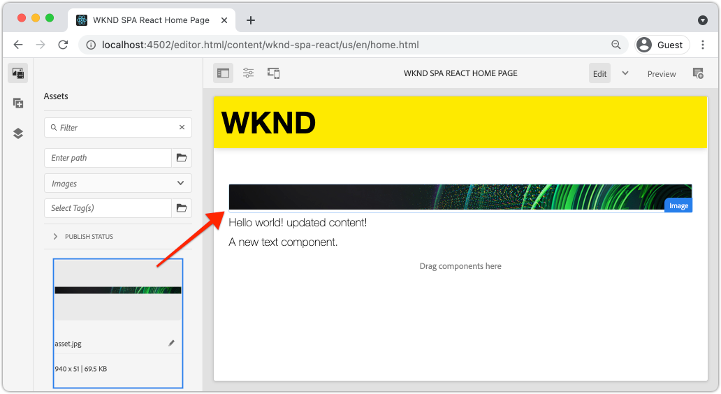
- Navigate to the Homepage http://localhost:4502/editor.html/content/wknd-spa-vue/us/en/home.html.
- You should now be able to use the additional components Image on the page.
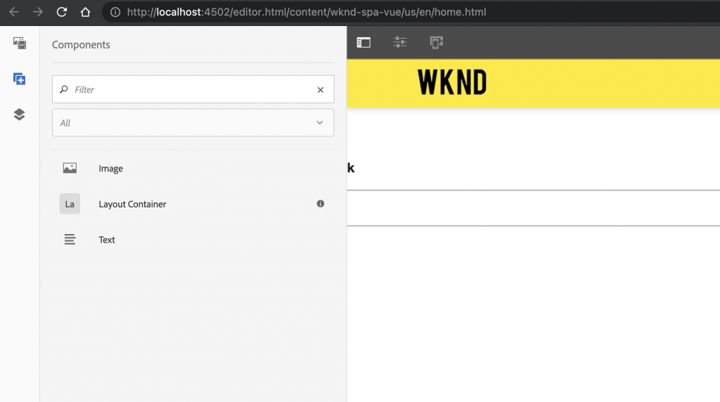
- You should also be able to edit the
Textcomponent and add additional paragraph styles in full-screen mode.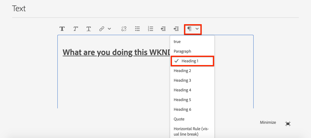
- You should also be able to drag+drop an image from the Asset finder:
Inspect the Layout Container
Support for the Layout Container is automatically provided by the AEM SPA Editor SDK. The Layout Container, as indicated by the name, is a container component. Container components are components that accept JSON structures which represent other components and dynamically instantiate them.
Let’s inspect the Layout Container further.
- In a browser navigate to http://localhost:4502/content/wknd-spa-vue/us/en.model.json
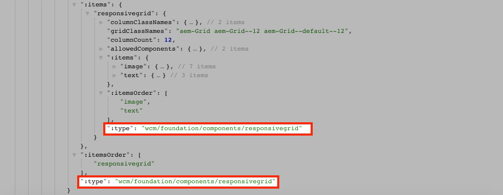 The Layout Container component has a
 sling:resourceTypeofwcm/foundation/components/responsivegridand is recognized by the SPA Editor using the:typeproperty, just like theTextandImagecomponents.The same capabilities of re-sizing a component using Layout Mode are available with the SPA Editor. - Return to http://localhost:4502/editor.html/content/wknd-spa-vue/us/en/home.html. Add additional Image components and try re-sizing them using the Layout option:
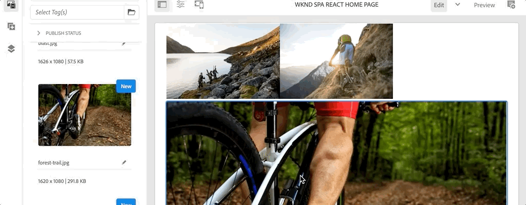
- Re-open the JSON model http://localhost:4502/content/wknd-spa-vue/us/en.model.json and observe the
columnClassNamesas part of the JSON: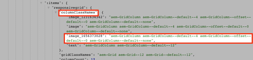 The class name
 aem-GridColumn--default--4indicates the component should be 4 columns wide based on a 12 column grid. More details about the responsive grid can be found here. - Return to the IDE and in the
ui.appsmodule there is a client-side library defined atui.apps/src/main/content/jcr_root/apps/wknd-spa-vue/clientlibs/clientlib-grid. Open the fileless/grid.less.This file determines the breakpoints (default,tablet, andphone) used by the Layout Container. This file is intended to be customized per project specifications. Currently the breakpoints are set to1200pxand768px.
Congratulations!
Congratulations, you learned how to map SPA components to AEM Components and you used the AEM Core Components. You also got a chance to explore the responsive capabilities of the Layout Container.