
❤️ CSS3
We love modern web standards. CSS3 APIs like Flexbox and Grid offer robust tools for layout – adept at cleanly handling common scenarios. Still, special circumstances arise. When they do, JS APIs like ResizeObserver are available to bridge the gap.
A Card Problem
On entry to a client automotive pricing application, the user is presented with vehicle cards in a carousel.
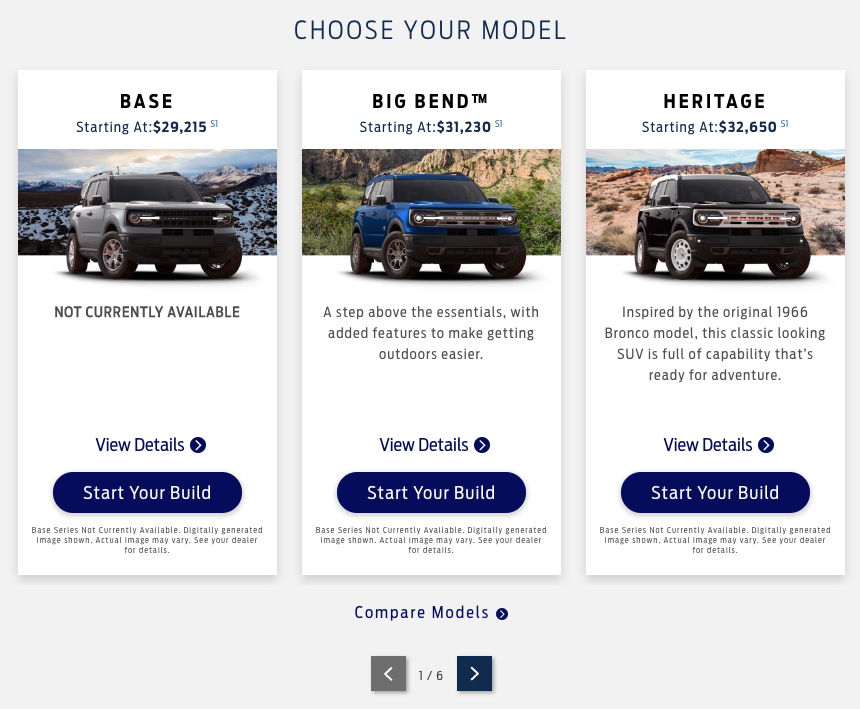
For some models, the cards are straightforward – names, pricing, images, marketing copy, disclaimers, etc. These cases more closely reflect the original design – a simple layout with alignment achieved with fixed heights, element positioning, and content restrictions.
Despite such cases, the underlying card components are dynamic and complex. Driven by authored content, service data, and application logic, there exist a large number of element combinations and sizes which may display for other model lines. Cards may have seasonal notices, incentives, option toggles, and other conditionally displayed elements – all driven by content, services, and configuration across a large number of models.
This complexity brings us to our problem – alignment. Without frequent design updates to keep pace with new features, the existing layout was stressed. Small content overflows or enablement of features would cause misalignment of adjacent card sections.

As more models displayed alignment issues, it was clear a comprehensive fix was needed.
Seeking Alignment
While redesigning the cards or adding restrictions on content authoring were possible, they would incur substantial client overhead.
What about available layouts APIs? CSS Grid, Flexbox, and Tables were all considered, but were either insufficient or required the same hack to utilize. Cards would need to be split into constituent sections and distributed across a layout. This would break encapsulation for the card components and increase complexity. We were also already displaying cards in multiple layouts, including both carousels and grids.
Maybe alignment was not the container’s responsibility, but the card’s. Could the card flexibly align itself with neighbors? With pixel-perfect alignment and no restrictions on configuration or content? Say hello to…
Resize Observer
ResizeObserver is an interface for monitoring dimension changes in the DOM. As a lower-level JS module, it’s not typically used for layout. However, with the power to efficiently monitor component sizes in realtime, it is worth considering in a pinch.
So how does it work?
const myObserver = new ResizeObserver(entries => {
    entries.forEach(entry => {
        console.log('height', entry.contentRect.height);
    });
});

const myEl = document.querySelector('.my-element'); myObserver.observe(myEl);
If we can measure the height of card sections, we can respond to size changes and inject a padding element to bring all section heights to the max sibling height. What might this look like in practice?
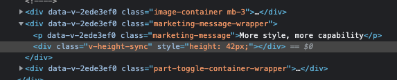
This wrapper element has a dynamically injected spacer to align with its neighbors.
An example with spacer elements highlighted.

Vue Directive
Our application is written in Vue, so we could implement a solution using a Vue directive. The logic for element observation, height calculation, and padding element injection would reside in one location and be cleanly applicable with a directive tag. When used, the directive would inject padding elements and register itself for height updates.
(demo to follow)
const registry = {
_lookup: new Map(),
};
// On resize events, trigger recalculation
const resizeObserver = new ResizeObserver((entries) => {
const targetKeys = new Set(
entries.map((entry) => registry._lookup.get(entry.target))
);
targetKeys.forEach((groupKey) => registry[groupKey]?.recalc());
});
function recalcHeights(groupKey) {
const els = registry[groupKey]?.els;
// Calculate max height and update spacers
...
// Update spacers
...
}
function zeroSpacers(groupKey) { ... }
function augmentAndRegister(el, groupKey = '_') {
// Append spacer el
...
// Add to registry
...
// Observe with resizeObserver
resizeObserver.observe(el);
}
function unregister(el, groupKey = '_') { ... }
function bind(el, { value: groupKey }) {
augmentAndRegister(el, groupKey);
}
function unbind(el, { value: groupKey }) { ... }
const directive = {
bind,
unbind,
};
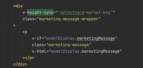
export default directive;This allowed card sections to be tagged with a height-sync directive and unique key. The following card template code indicates the ‘.marketing-message-wrapper’ section will be height synchronized across any card instances. (If multiple card sets are desired, a composite key with the card group may be used.)
Alignment Demo
See this pattern implemented in vanilla JS on Codepen.
See the Pen Resize Observer – Height Demo by Ryan Jones (@TheRyjo) on CodePen.